Expanding branding to print in the flagship manual

Timeline
5 Months
Role
Graphic Designer & Project Manager
Team
Marketing Director
Graphic Designer (me)
Training Division Director
(3) Training Practitioners & SMEs
Copywriter
TL:DR
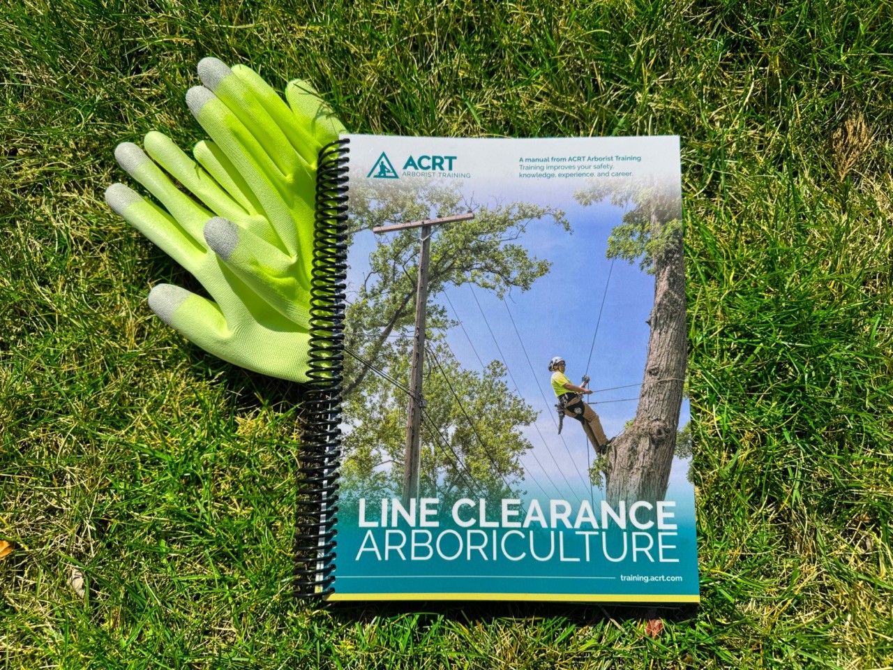
The flagship product of the nation’s leading arborist training school needed a re-design to increase class sign-ups, align with the branding of the parent company, and reflect new arborist training methods.
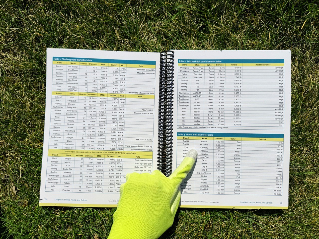
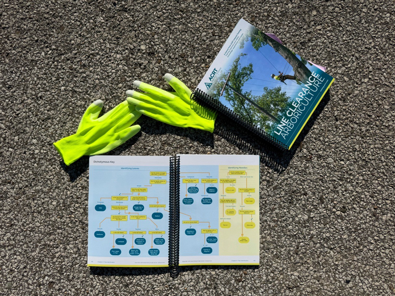
I designed a 300 page manual and derivative handbook with over 150 proprietary technical illustrations, expanding company branding. I developed the project timeline, led multiple review sessions with arborist training SMEs to ensure technical accuracy, and ran tests with print vendors.
The final manual paid for production with profits from the first week of product sales. Arborist training class signups also increased.
Problem
Historically, the manual struggled to meet organizational goals:
Arborist training instructors believed it lacked clarity for class use
Marketing team believed it lacked the polish that made sales easy
Additionally, there was no budget for further photography yet there was a need for more instructional visuals. However, the company branding had never been applied at such scale in print.
Expanding Branding Within Print Mediums
The manual had not had a visual or branding update in 10 years and the company’s new branding had never been applied at such a scale in print. I gathered print and digital materials and resources that utilized the new branding to identify key motifs and repeated visual vernacular. from my findings, I developed sample pages of the manual that utilized brand motifs and expanded on them to meet the levels of visual and typographic hierarchy that the technical manual required. I proposed this application and expansion of the brand to the Marketing Director, Operations Manager, and company leadership. Upon approval, I created a manual specific brand guide to reference throughout my development.


Designing 150+ Technical Illustrations
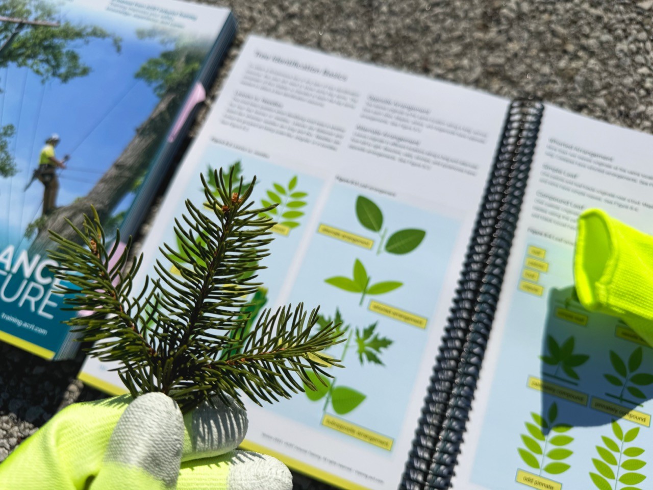
The company had no budget for further photoshoots for the manual, yet the arborist training SMEs wanted more visuals of specific concepts. I led detailed collaborative sessions with the arborist trainers to review their iPhone photos of concepts, clarifying the key elements. From my detailed notes, I developed a color library and experimented with different illustrative styles, balancing speed and detail. I created a library of hundreds of vector illustrations and again led collaborative sessions to refine them with the trainers who would use them.


Reflections
I wanted to sit in on arborist training classes to see how students and instructors used the new manual, identifying opportunities for improvement or expansion of the illustrations library. I was laid off due to industry wide budget cuts before this could happen.
However, this project proved my ability to manage complex inter-departmental projects and my ability to understand and evolve branding across mediums. I was able to further exhibit this in projects for KIKO Auctions which eventually led to evolving 80 years of brand perception across print & digital for a new division.
